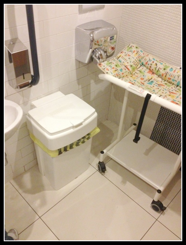
This Baby Change Facility of the Week is a spectacularly poor example. The image was taken in a restaurant in North London. Look closely and you’ll see it is wrong on many levels.
Let me start by saying this facility was laid on in a disabled lavatory. You can’t really see it from the photo, but the change table (which looks like something from the film set of One Flew Over the Cukoo’s Nest) was directly in front of the door. Quite how someone in a wheelchair was expected to get past, I don’t know.
It would also have been necessary to do a 90 degree turn to get to the lavatory itself. Far from easy with that table in the way.
As you can also see, the table was just left in front of the hand dryer. It sort of left me thinking that a change table had just been flung in the lavatory with no thought whatsoever.
I appreciate that retail space is expensive. I’m never, however, all that comfortable when disabled and baby change facilities are combined. It just makes me feel awkward in cases someone with a greater physical needs the loo.
I give this example one out of ten on the basis that there was a bin and a table. What do you think ‘though, what score would you give it? Please do leave a comment and score below.



3 thoughts on “Baby change facility of the week No2”
I agree, 1 out of 10. It seems like they’ve decided to tick a box rather than care about the functionality of the facility itself.
Thanks for stopping by Tony. It’s a truly appalling example. Worse still, it’s those with mobility issues who will face the biggest challenge using their facility.
Pingback: Baby change facility of the week No3 4/9/14 | Dad Blog UKBaby change facility of the week No3 4/9/14 - Dad Blog UK