Having learned that the secret to getting a good photograph can involve being somewhere at the right time, I paid a visit to the London Borough of Croydon just before sunrise. I had heard about an urban art festival called Rise and thought some of the art that was on display on the streets might look good in the early morning sunlight.
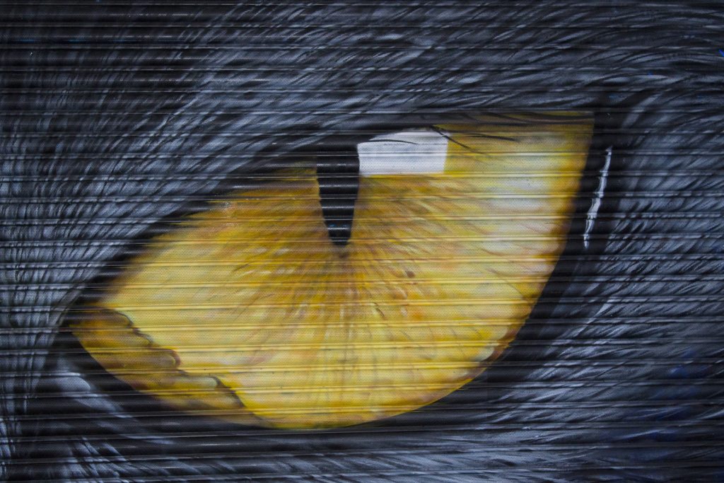
I also had a vaguely amusing idea to capture the sunrise from the top of one of Croydon’s many multi-storey car parks. Alas, Croydon had the last laugh because the sun barely broke through the clouds. The best picture I took was this image of a cat’s eye staring straight ahead.
I should explain that Croydon and I have history. It’s quite close to where we used to live so I know it well and it’s a great location for urban photography, even if it’s a bit of a journey from where we live now.
I’m afraid a huge plant feature prevented me from photographing the other eye, but I find myself drawn into it nonetheless. For a piece of graffiti art (street art, call it what you will), I think it features some amazing detail.
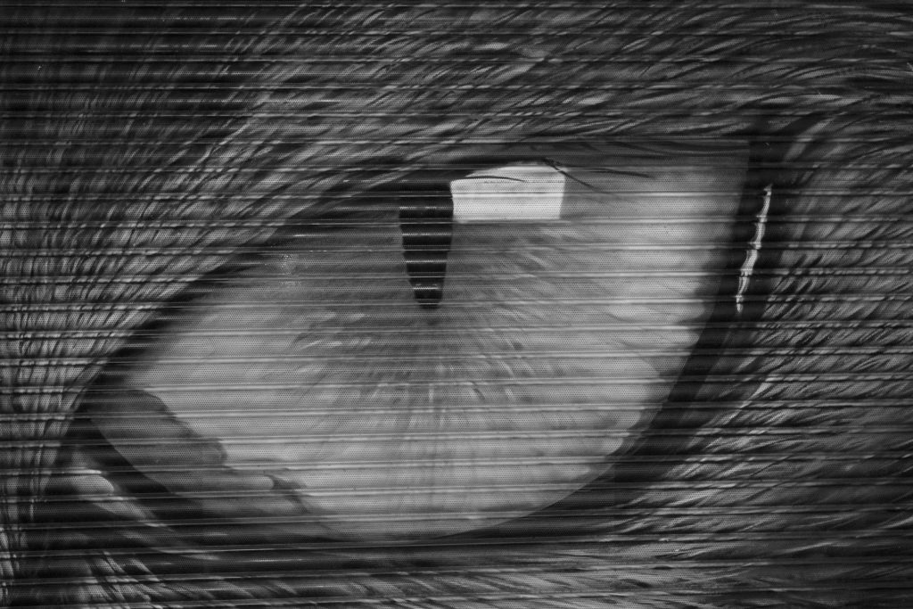
I had a little play in Photoshop and produced a black and white version too. I think both work well, but I prefer the colour version. I’d be curious to know though, which do you think works better, colour or black and white?
If you like this image, please do take the time to click on the badge below. This will take you to the #MySundayPhoto linky hosted by the Photalife blog. You’ll have the chance to see imagery taken by other bloggers and there’s some real talent for you to explore.



25 thoughts on “Here’s looking at you kid”
It has to be the colour because that is how it was painted! Cheltenham has just had its annual paint festival and some amazing art has appeared around the town. I’ve seen a few pieces, but need to go out and see some more.
Not the kind of thing I’d expect in Cheltenham! Anyway, colour has definitely won hands down this time around.
Morning John. Colour for me too. I think you get much more of the detail. It sounds like a fantastic festival. Sorry you didn’t get your sunrise though. #MySundayPhoto
Never mind, I’ll capture a sunrise another day! There’s some quite varied art on display I have to say.
Cracking photo. One for the wall! Def prefer the colour!
very kind of you to say so Tom. Maybe I could get the artist to do a copy on a wall at home??
Oh that is striking, it has one talented designer. Colour version works for me, gives more definition.
Everyone seems to prefer the colour one. I’m not surprised though, it is very striking.
You’re right about being drawn into the detail. Colour for me too. The horizontal lines are competing in the b&w to much for me. #MySundayPhoto
Ah, yes, I see what you mean about the horizontal lines. Glad I’m not the only onw impressed by the detail of the painting.
Very strong photo, I much prefer it in colour. If you fancy some street art pop down to Brighton
Have a good Sunday and thank you for linking up to #MySundayPhoto
Very good suggestion about Brighton! Perhaps we should do a photo walk round there one day?
Wow thats an amazing piece of art
Yeah, looking right back at you isn’t it?
I know the pain of a recalcitrant sunrise. The eye is amazing, I’m always impressed by people with artistic talent. The colour version for me too! #MySundayPhoto
Another vote for the colour version! That one is proving most popular.
That is a fantastic photo! I love the one in colour.
Street art really is amazing x
Street art is always much more accessible isn’t it? the colour version was certainly the most popular.
Hi John, well, judging by these photos, you may well have had the last laugh! And whoever painted them is a very talented artist. The detail is amazing. The reflection of light beside the pupil really catches my eye. I do prefer the coloured photo though, I like the yellow iris… I’d love to see a photo of the sunrise taken from the top of a carpark. I’m sure it would be refreshingly different.
#MySundayPhoto
xx
Well who knows Debbie, maybe one day I will get that car park photo. The street art is very detailed isn’t it?
What amazing art! I definitely prefer it in colour too. 🙂
Thanks, yes, a lot of people seem to agree the colour version is the best.
Fantastic street at. So detailed. The colour is definitely the most striking photo. Love it!
I’m a lover of colour so to me the first is more striking #mysundayphoto
The colour for me works best as well. Shame you did not get the sunrise you had hoped for. I always admire street art, love how they manage to get very large pieces of work onto a full wall and still get stunning effects. #MySundayPhoto